Case study
Amplifying Impact: optimizing social sharing on GoFundMe
Overview
Sharing is critical to the success of GoFundMe campaigns as it helps people discover them. In fact, sharing can be even more valuable than donating because it can encourage others to contribute. Our project aimed to increase the gross donation value of campaigns by increasing the number of people who share them. Our hypothesis was that more shares would lead to more visitors to the campaigns and ultimately, more donations
Research
Through our research, we discovered that highly engaged donors primarily learn about fundraisers through Instagram, rather than Facebook, which was surprising to us. However, we also found that there are several psychological barriers to sharing, with some donors finding it easier to donate than to share. Donors often view their contributions as personal and do not prioritize telling others about it. Frequent donors are passionate about helping others and prefer to turn attention outward rather than inward. Donors are also concerned about others feeling guilt, shame, or embarrassment if they are unable to donate.
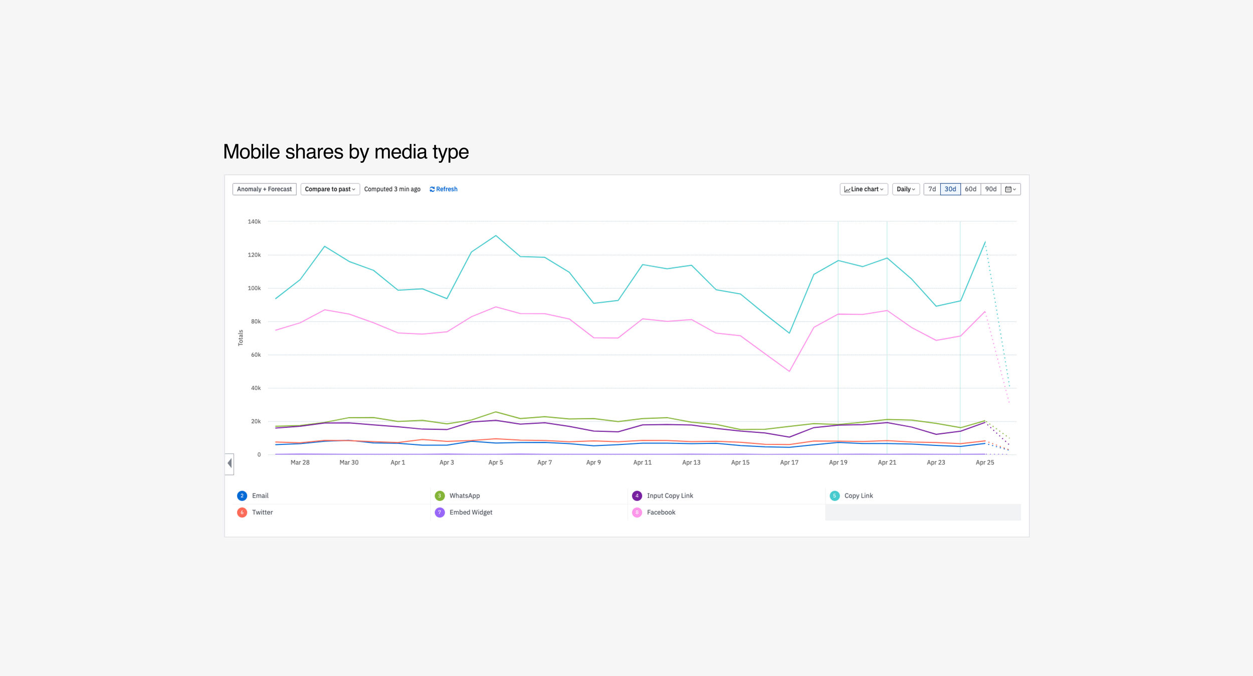
Furthermore, our research revealed that donors do not fully understand the impact that sharing can have. On the quantitative side, we found that the most frequently used share method was the copy link option, followed by Facebook. Although we were able to track most traffic coming from Facebook, we also recognize the importance of other platforms like Instagram for fundraising campaigns.
Amplitude dataInsightsChallenges
We faced challenges with mobile web sharing as users are accustomed to the robust sharing capabilities of native apps. Sharing from mobile web poses a significant technical challenge, resulting in a subpar user experience. Unlike native apps, there is no natural way to bring up an app from a mobile web share sheet.
In addition, we had limited time to complete the project. We had only one month to conduct research, design, and build the solution.
How I’m feeling at this stageOpportunities
Including Instagram in the share sheet presented a significant opportunity for us as it was a platform that people were already using. By streamlining the sharing process, we hoped to encourage users to share more and drive more traffic to fundraisers.
To decrease the mental load for users, we believed that creating assets for users to choose from would be beneficial. We anticipated that this approach would perform better and drive more traffic to fundraisers.
Moreover, we recognized that there was room for improvement in the content and flow of the share sheet. We aimed to better convey the importance of sharing and decrease friction in order to encourage users to take action.
Share asset explorationsFlow explorationsExplorations
During the exploration phase, we considered numerous options, but quickly identified Instagram sharing as the most promising feature for the MVP. We knew that our users were interested in Instagram sharing, and that the ability to include a sticker link on Instagram would drive traffic back to GFM. However, we needed to find a way to take users from GFM mobile web into the Instagram app, as Instagram did not allow for this behavior.
After evaluating several options, we identified three possible solutions: (1) directing users from GFM mobile web to the GFM app, then linking over from there; (2) having users download the asset to share later; and (3) utilizing the native share sheet and hoping that Instagram was present. We ultimately decided to go with this approach.
Potential user journeys Explorations cont
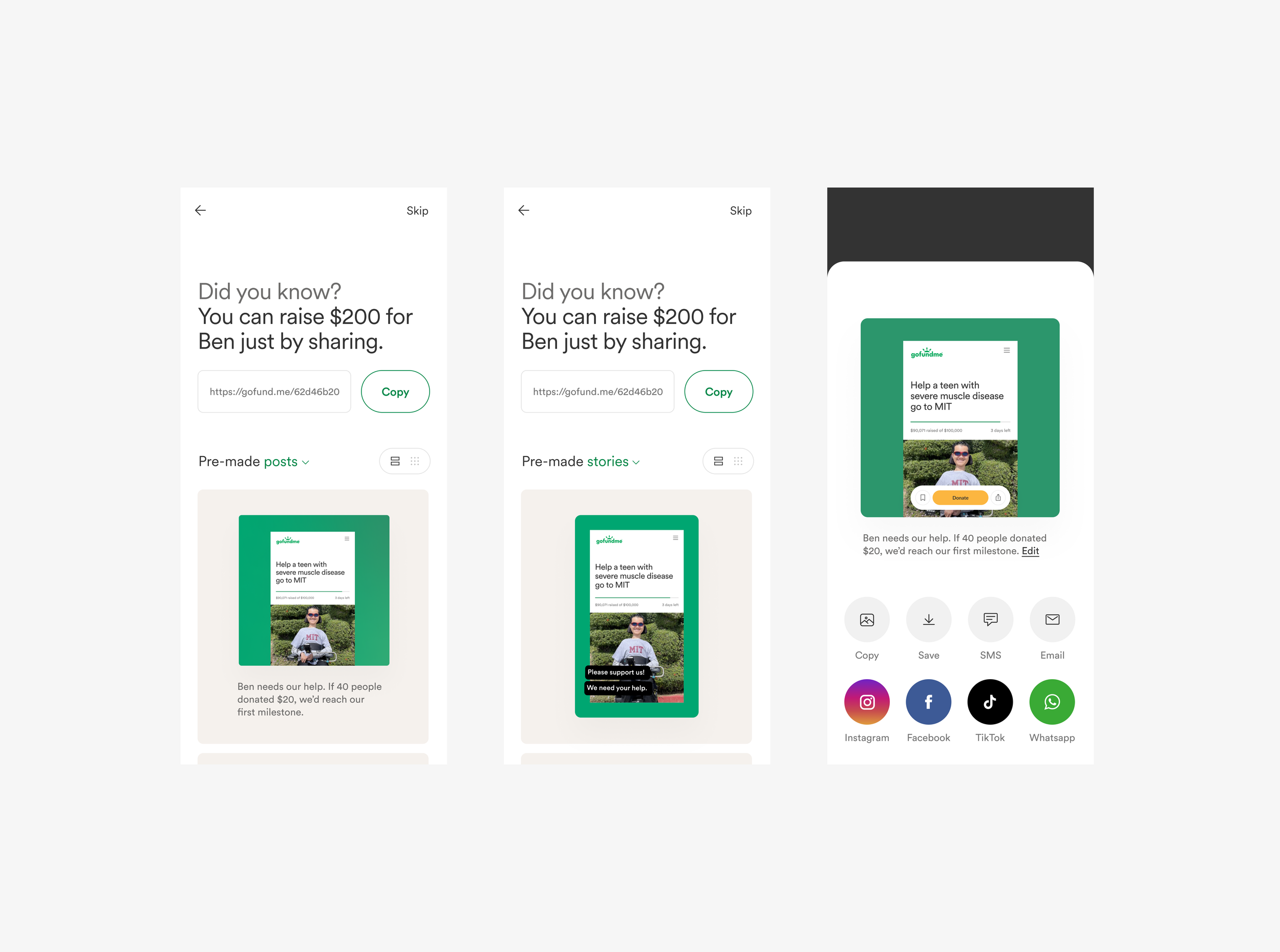
In addition to addressing the technical constraints of opening Instagram, we also focused on designing the optimal user flow for selecting an asset and copying the link. Despite the volume of content, our priority was to make the process as seamless and intuitive as possible.
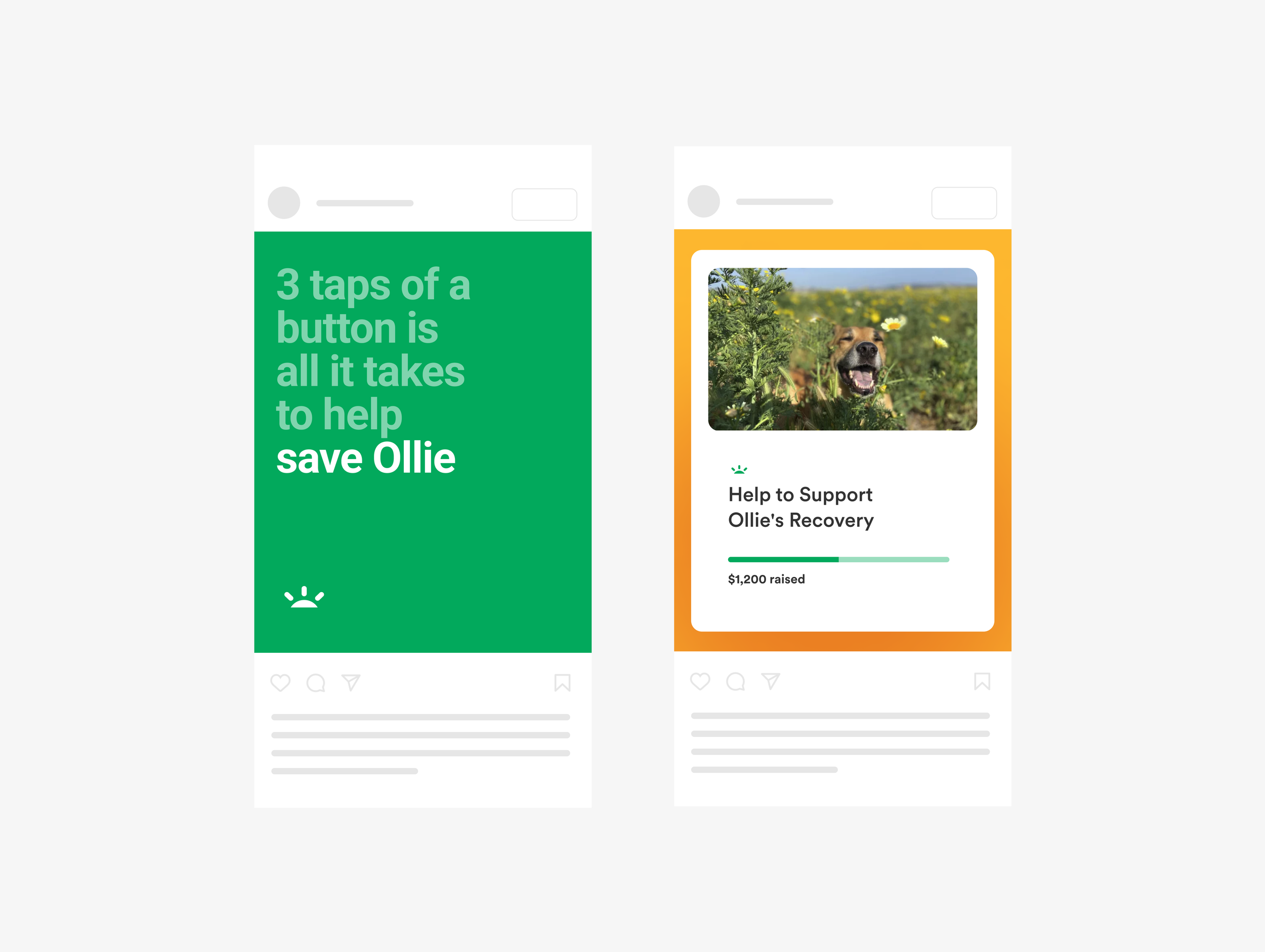
In parallel, we experimented with different types of shareable assets, such as UI-based assets, typography-based posts, and neutral assets that catered to users with specific aesthetic preferences.
Throughout the project, we closely collaborated with PMs, engineers, and executives, gathering feedback and iterating to arrive at the most viable solutions.
Flow explorationShare asset explorationsSolutions
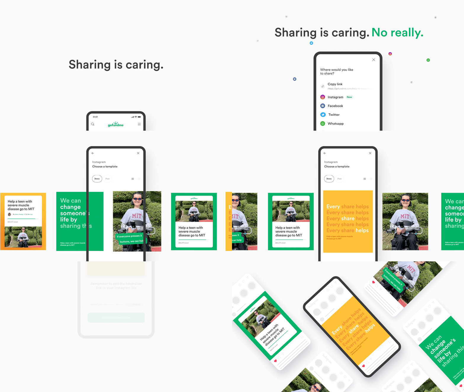
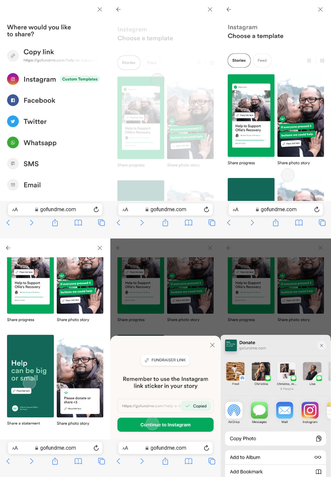
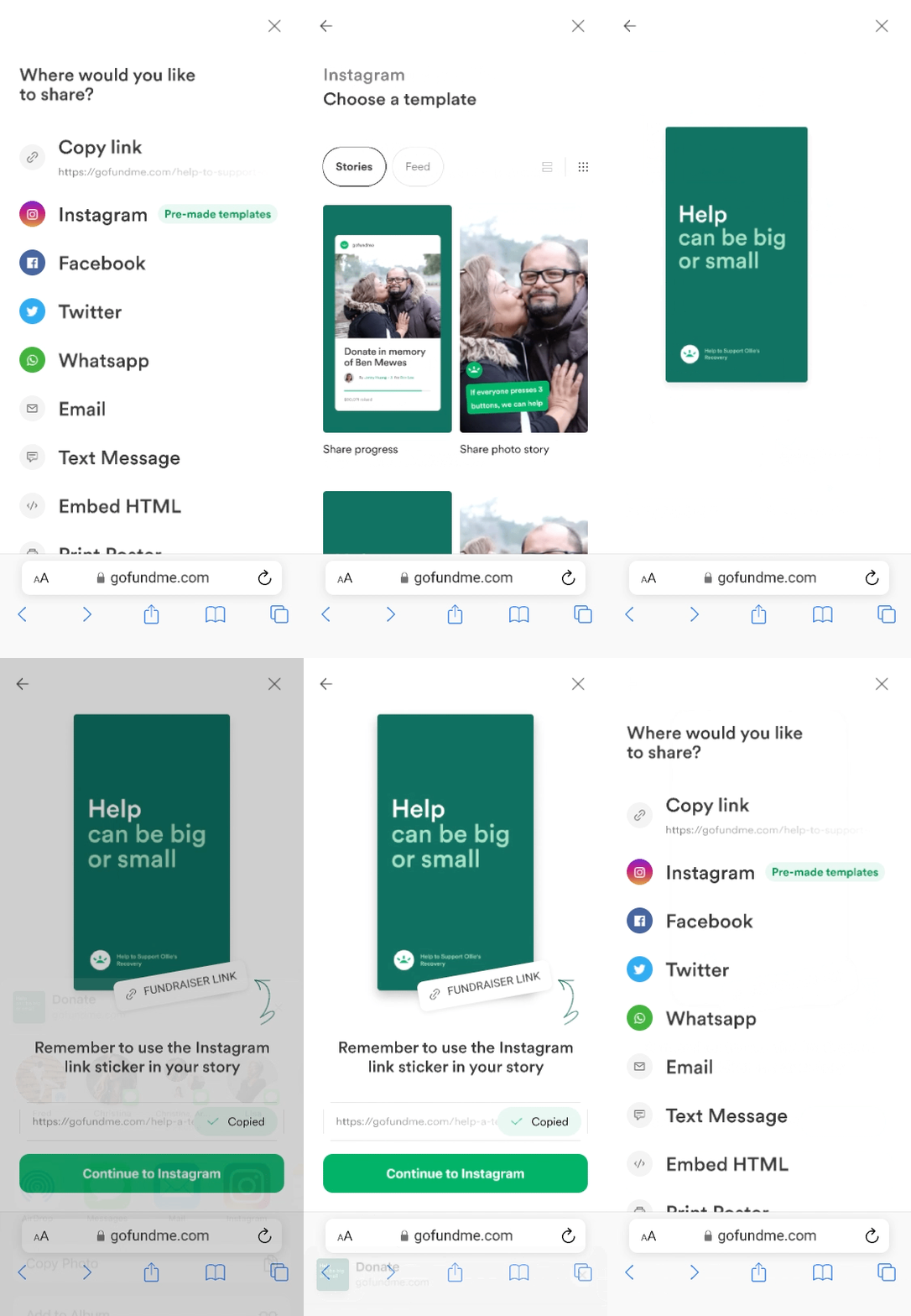
After evaluating different options, we implemented a new flow that included Instagram as a sharing option. To make it easier for users, we added several share assets that users could choose from. Once a user selected an asset, we prompted them to copy the fundraiser link and reminded them to add it to their post. From there, we opened the native share sheet. Unfortunately given the time constraints we released this as a mobile-only feature.
We launched the new feature with four types of templates that performed well in user testing: photo, photo with caption, UI-based, and typography-based.
MVP flowMVP assetsResults
Following the launch of our updated sharing flow with Instagram integration, we were pleased to see that Instagram became the third most popular share channel, after Facebook and copy link. We ran several tests and discovered that adding the fundraiser's URL on the share asset was beneficial, in case people forgot to add a sticker link.
The results of the project were deemed successful. Within the first month of launch, we surpassed 1 million in gross donation value (GDV) from Instagram sharing. We proceeded to productionize the feature in August 2022.
