Case study
Improving the discoverability of fundraisers GoFundMe
Overview
GoFundMe is a popular platform where individuals can create and share fundraising campaigns. The goal of this project was to improve the discoverability of fundraisers on the platform by adding new features, increasing relevancy, and redesigning the UX and UI of the search function.
The target users were donors who were mostly looking to donate to fundraisers they had already seen elsewhere. These donors valued community and impact and were mostly interested in campaigns that aligned with their interests.
Research
During our research, we found that location-based search was the most asked-for feature. Additionally, we found that perceived impact was important to donors. They wanted to feel like they are making a difference. When asked about search experiences donors also referenced our competitor Kiva's faceted search as a positive example of search functionality.
Quantitative analysis revealed that there was limited browsing behavior on GoFundMe, with donors typically having a specific fundraiser/campaign organizer in mind when using the platform.
Consolidated insights Kiva exampleChallenges
Surfacing relevant fundraisers was a challenging task, particularly because of the limited data we have about our donors. We don’t require donors to make an account so we know very little about them. However, we do know that donors have specific interests, and we lacked insights into what would appeal to them. We knew community and alignment with their values were crucial factors for the decision to give, but finding relevant fundraisers despite the absence of adequate user data was a major hurdle.
To add to this challenge, the project had a strict timeline of two months to research, design, develop an MVP, and run subsequent tests, adding to the pressure of achieving results.
How I’m feeling at this stageOpportunities
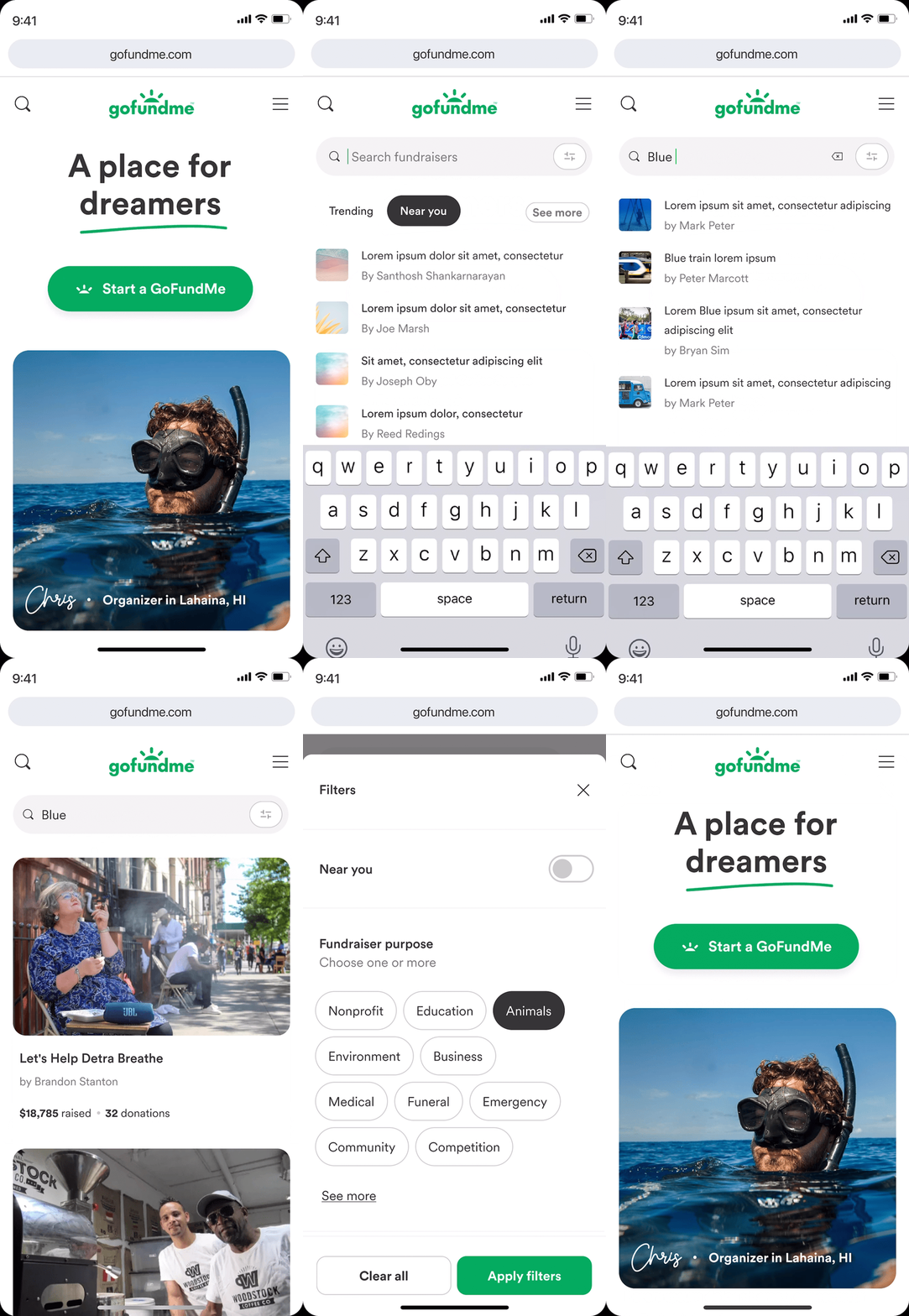
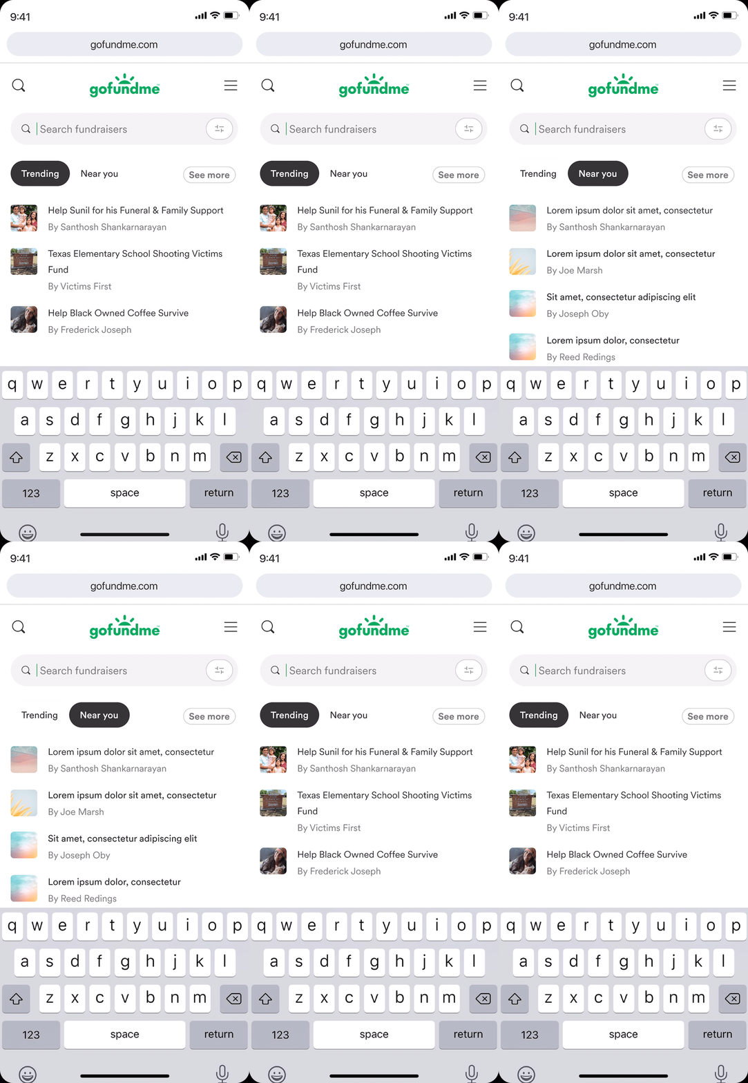
One significant opportunity we identified was the lack of an empty state in the existing search functionality, which meant that donors needed to have a specific campaign in mind to conduct a successful search. By introducing an empty state that displayed trending fundraisers, we could ease the mental load on donors and encourage more passive browsing behavior.
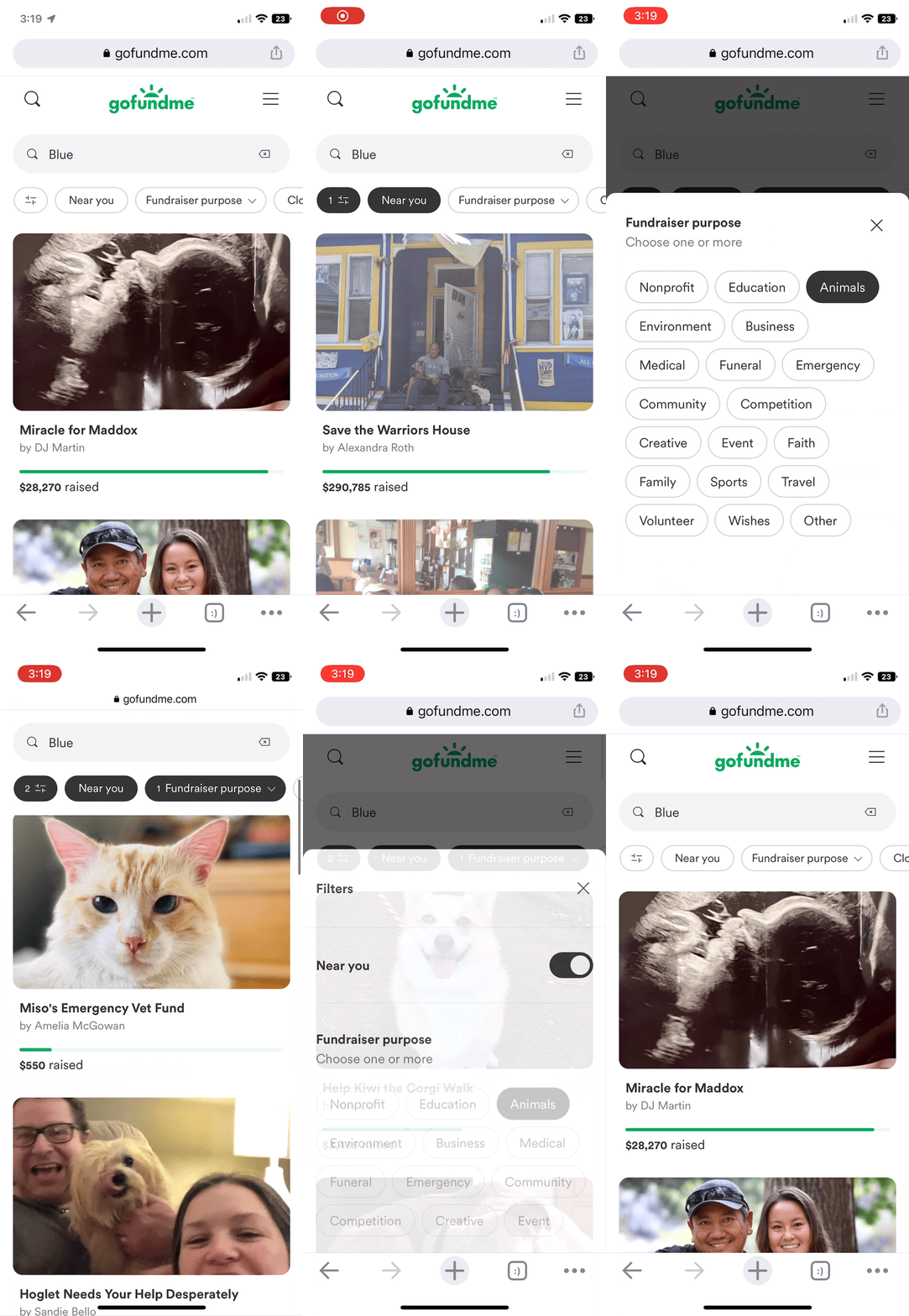
Our research also revealed that location was a crucial factor for donors, and presenting fundraisers in a community context could be an effective way to increase discoverability. Furthermore, we believed that incorporating filters could create opportunities, particularly for passive donors, to refine their search results and increase the relevance of the fundraisers shown.
Existing search Community approachSearch by locationExplorations
There was a lot to explore between the user flow and all the new features we wanted to add. We considered many different options and there were many decisions to be made, such as adding an "explore" empty state, deciding on the content to display on the empty state, determining the information to show on campaign cards, and the depth of our location-based search feature. We also spent time refining how to present filters to our users.
This was a highly collaborative process, where we had to work within a tight timeframe. Due to time constraints, we decided to forego user testing and instead ran experiments on our production environment. In order to compensate for the absence of user feedback, I sought extensive feedback internally from other designers, engineers, and my project manager to thoroughly test our ideas and iterate on them.
ExplorationsSolutions
Through this collective effort, we evaluated many possibilities and arrived at what we believe was the best solution for the user given the constraints. Our MVP includes several key features:
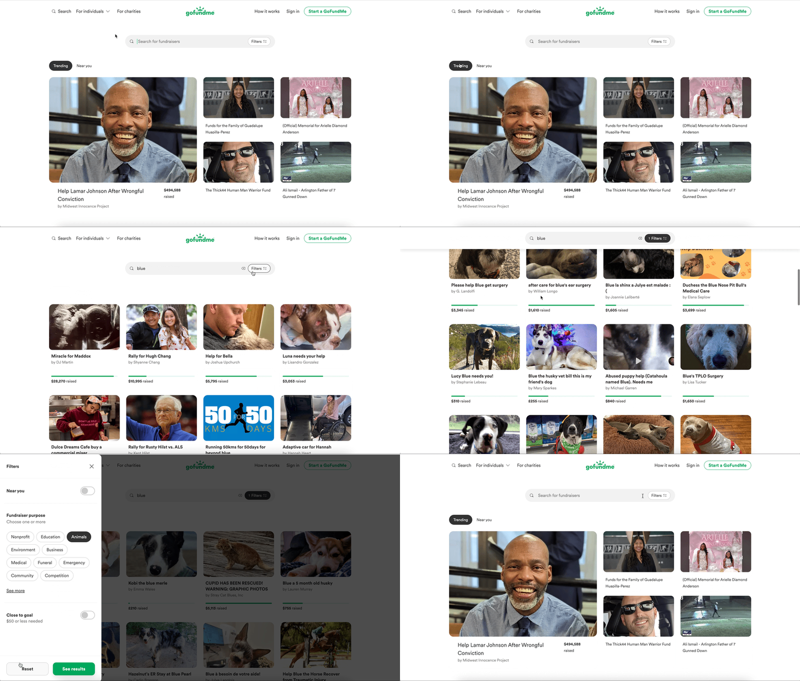
We redesigned and updated the search function, with a new layout that adapts to different device sizes and the addition of instant search functionality.
We introduced a new empty state that highlights trending campaigns and fundraisers in the user's local area.
We implemented impact filters for users to narrow down their search results based on proximity, categories, and campaign progress (such as "close to goal" or "needs momentum").
Empty stateFiltersDesktop layoutResults
After launching, the team ran three experiments and found that the "near you" filter and empty state were well-received by users. The team also found that the trending empty state acted as an amplifier during current events. The impact filters did not perform as expected, but after further experimentation, we revised the filter to highlight only close-to-goal campaigns. The project was considered a success and was launched in November 2022.


